The Pipeline Movements module is designed to understand the movements of your pipeline at various periods of the quarter.
Pipeline on Day 'x' of Quarter
This chart shows how the various pipeline stages looked on the Day 'X' of a particular quarter. The quarter you want to view can be selected from the dropdown, and it could be any quarter in the past.
You can also select the opportunity stage(s) to view. You can toggle between the chart view and the table view.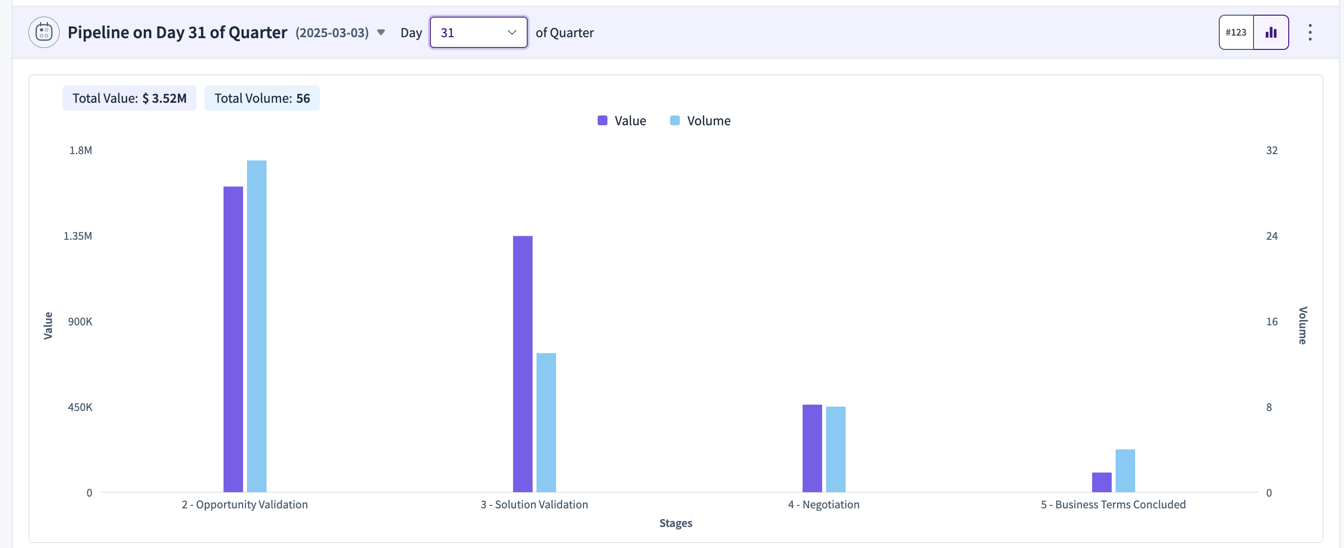
Pipeline at the end of the Quarter
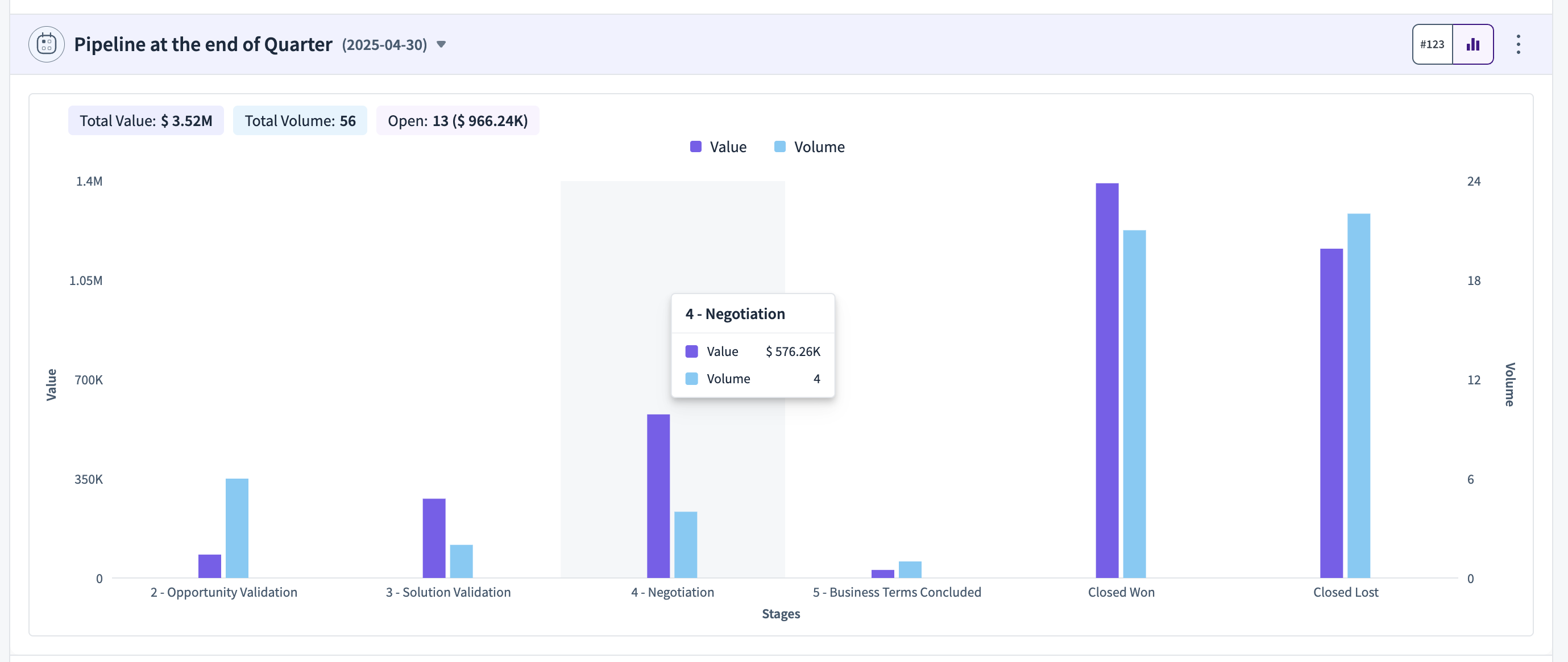
This gives you what happened to the Pipeline on Day 'x' of Quarter at the end of the Quarter. It is a cohort of what was the pipeline on Day 'x' of Quarter analysed at the end of the same quarter.
The closing quarter and the opportunity stages to view can be selected from the dropdown. You can toggle between the chart view and the table view.
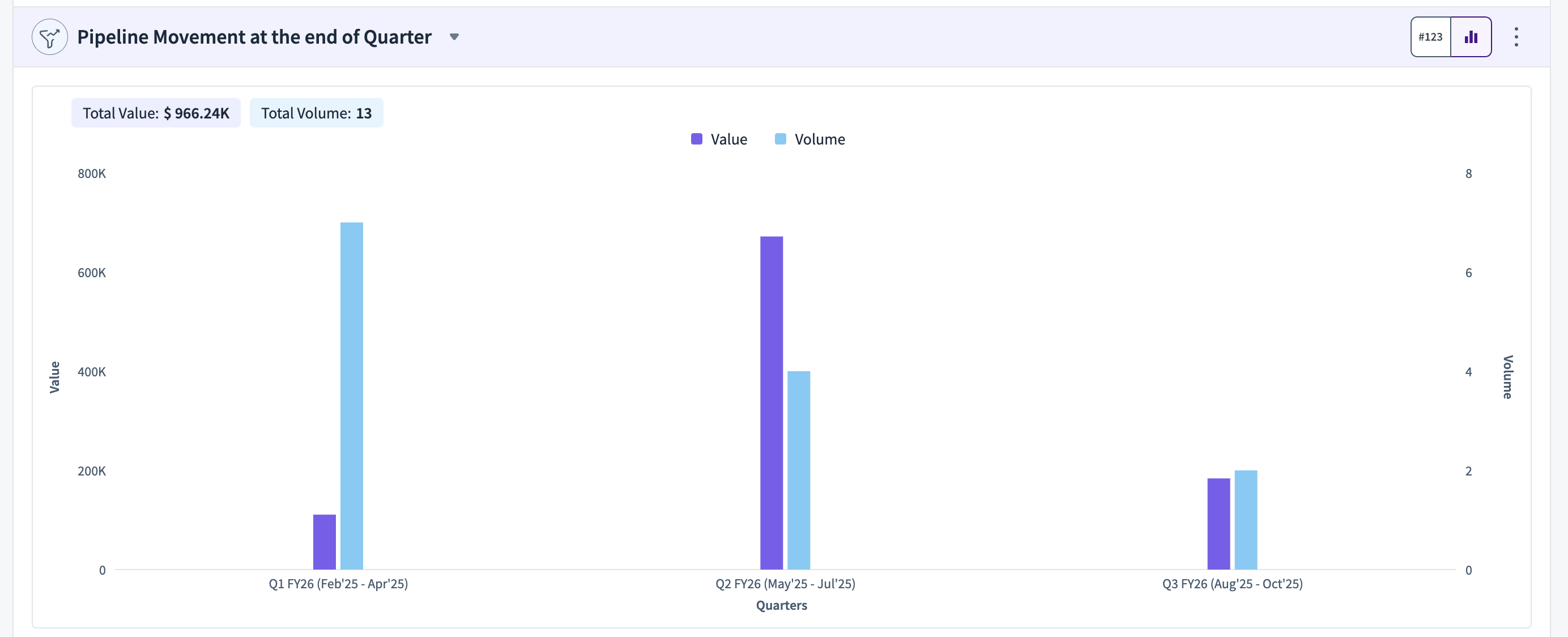
Pipeline Movement at the end of the Quarter
This widget shows which quarters did the open pipeline at the end of the quarter move to (or) got pushed out to.
Funnel Movement Trends by Stage
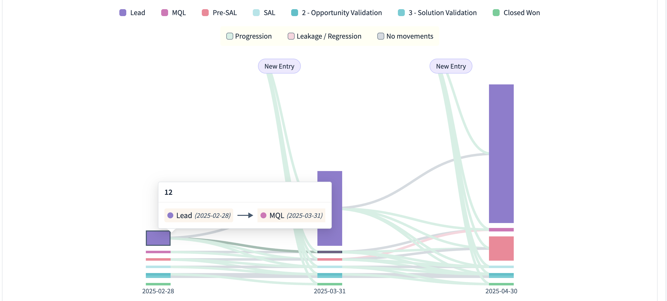
The Funnel Movements Chart gives you what happened to a cohort of leads/opportunities at the end of each quarter, accounting for new entries, movements, progressions, and regressions.
Each bar represents the various funnel stages that are open at the end of each month from the created cohort. You can define the cohort by defining what your created period and progressed period. Define how you want to see movements (By week/ month/quarter), view by Value/Volume, and which funnel stages to view.
From each bar, the chart shows what was the movements as of the next bar's date. The movements are color-coded as follows:
Grey bars represent No Movements
Red Bars represent Regression (or) Leakage
Green bars represent Progression