Overview
RevSure's Demand Generation Effectiveness module helps marketing and demand generation teams answer key questions such as "Which campaigns have higher ROI?", "Which channels have lower CAC and higher funnel velocity?", and "What is the overall ROI of all demand generation efforts from the previous quarter?"
Key Features
Maximize pipeline and ROI from demand generation efforts
Analyze campaign performance based on lead generation cost, ROI, and velocity
Overall metrics for all demand generation efforts in a year or quarter
Specific insights at the campaign and channel level
.png)
Demand Generation Effectiveness
Filters
.png)
Apply filters for any data you would like to include, and choose how you want to view your trends: Monthly or Quarterly. More about filters here.
You begin with the Key Metrics, which highlight — for the chosen period — Budget, Actual Spend, Number of channels invested in, Number of campaigns run, Cost per Lead, Pipeline ROI so far, and Booking ROI so far, plus the Projected Pipeline ROI and Projected Booking ROI from open leads and opportunities.
Controls
Toggle the Summary Metrics on or off, and choose which metrics to display or hide.
Select the Campaign Contribution button to see each campaign's contribution percentage toward each metric.
Select the Smart Filter to filter based on custom conditions.
Select the Funnel View button to see a Generated or Open snapshot of the funnel for a particular campaign or channel.
Select the RevSure Insights button to get recommendations on whether to stop, wait, or continue a campaign.
Toggle View Growth to see the delta change of metrics in the table on a weekly, monthly, or quarterly basis.
Toggle View Trend Chart to see MoM, WoW, or QoQ cumulative or relative trends.
Toggle Color Code Cells on or off to see color coding that highlights the best- and worst-performing campaigns or channels on a metric. Darker shades of green indicate the best performers; darker shades of red indicate underperformers.
Tabular Representation
You can also view the Generated, Open, Converted, and Leaked volume (count) of leads, opportunities, and closed-won bookings — and, similarly, the dollar value of those leads, opportunities, and bookings.
.png)
Below, you get detailed insight into channels and campaigns. Every channel and campaign comes with key outcome metrics such as Budget, Spend, Cost per Lead, Pipeline ROI, and Booking ROI.
You can dig deeper into each campaign to see cross-funnel metrics and insights such as Generated Volume, $ Value, Stage-to-Stage Conversion, Stage-to-Stage Velocity, the number of activities performed before converting to the next stage, what those top activities are, how many leads and opportunities are currently active, and their actual or predicted pipeline value. You can choose which columns appear in this tabular view, as well as the funnel stages and states, and the cross-funnel metrics. You can also view the insights from a first-touch or last-touch campaign point of view.
.png)
You can sort the columns in the table to surface key insights easily — for example, channels with the highest spend. Alternatively, you can sort and filter the table using the Insights selection — for example, the top 3 channels with the highest spend.
.png)
Visualizations
To visualize campaign performance and see the top-performing campaigns and channels by metric, click the bar icon next to the trend icon at the top right..png)
Select the dimension you want to analyze — a campaign, a channel, a lead source, and so on. Then choose which metrics to show on the X-axis and Y-axis.
.png)
Trends
In the Trends section, you can view the performance and trends of your campaigns in a tabular view or as a graphical representation across different time ranges.
In the chart view, select the dimensions you want to trend, the cadence (weekly, monthly, or quarterly), the metric to plot on the primary and secondary axes, and whether to view the data cumulatively or relatively. This lets you visually track how a campaign performs against your chosen metrics over time.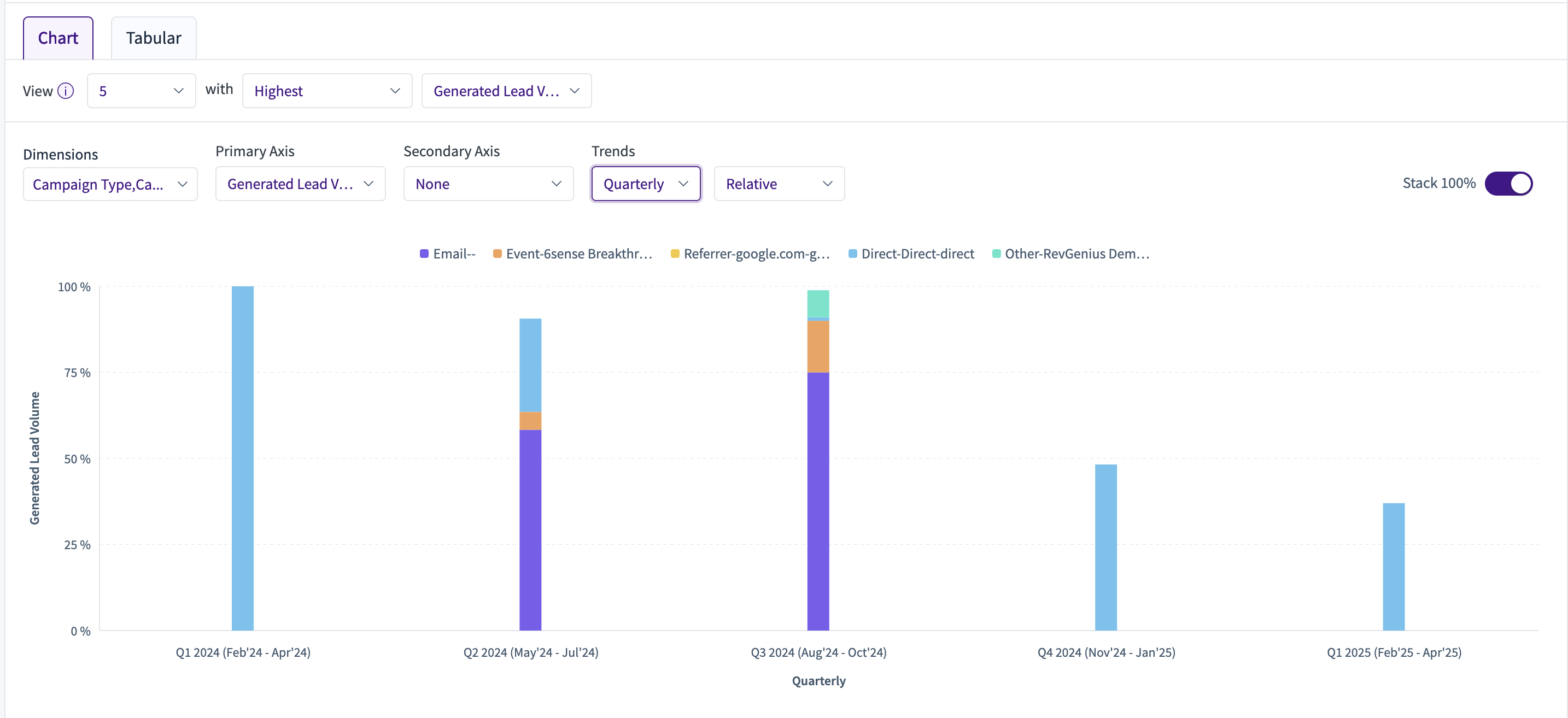
The tabular view shows a consolidated table of the same data: the dimensions you selected on a quarterly, monthly, or weekly trend, alongside the metrics you selected.png)
The key difference between the table view and the trend view lies in how each handles time filters:
Table view aggregates across all time, so opportunities created in a given quarter (e.g., Q4) will count campaign touches from any prior quarter (Q1–Q4).
Trend view, when set to quarterly, restricts attribution to touches that occurred within that specific quarter. For Q4, only campaign touches from Q4 are considered — a W-shaped attribution model scoped to the quarter.
That's why generated pipeline numbers may appear lower in the trend view than in the table view.
FAQ:
Why do numbers differ between a standard table view and a Trend (Line Chart → Tabular) view, even when the filters are the same?
You may notice differences in metrics between the two views even when the visible filters appear identical. This happens because trend views apply time-period filters differently behind the scenes.
In trend views, the query automatically applies the selected quarter (or time period) consistently across all period-based filters used in the calculation. In a standard tabular view, those same period filters must be manually aligned to the same quarter or date range.
As a result, if the tabular view does not have matching values applied across all relevant Period Filters, metrics such as Generated Pipeline Value may differ significantly from the trend view.
How do I make the values match?
Verify that all Period Filters in the standard tabular view are set to the same quarter or time period used in the trend view.
Confirm that cloned views retain all underlying period-filter logic, not just the visible filters.
Performance and Trends
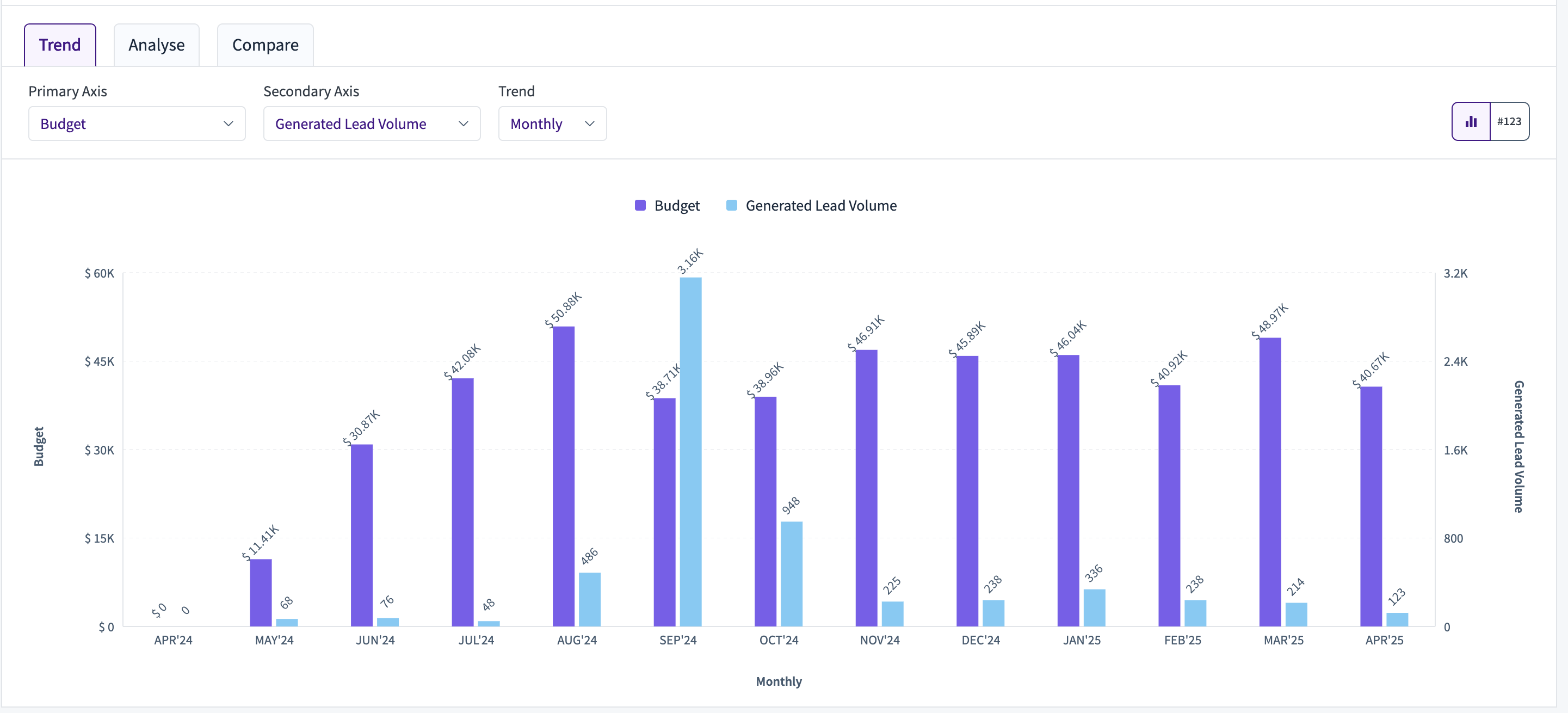
This section appears under the chart visualization. Here you can view trends, analyze performance, and compare results..png)
Trend
The Performance & Trends section offers several sub-views. In the Trends sub-view, plot a graph by selecting your dimension in the Primary section, along with a secondary axis, to see a trend view.
Analyze
In the Analyze sub-view, you can create a bubble chart from your selected criteria to understand how these bubbles behave over time. Select your color from the list of dimensions, your bubble dimension, the metrics for the primary and secondary axes, and the dimension that defines bubble weight.
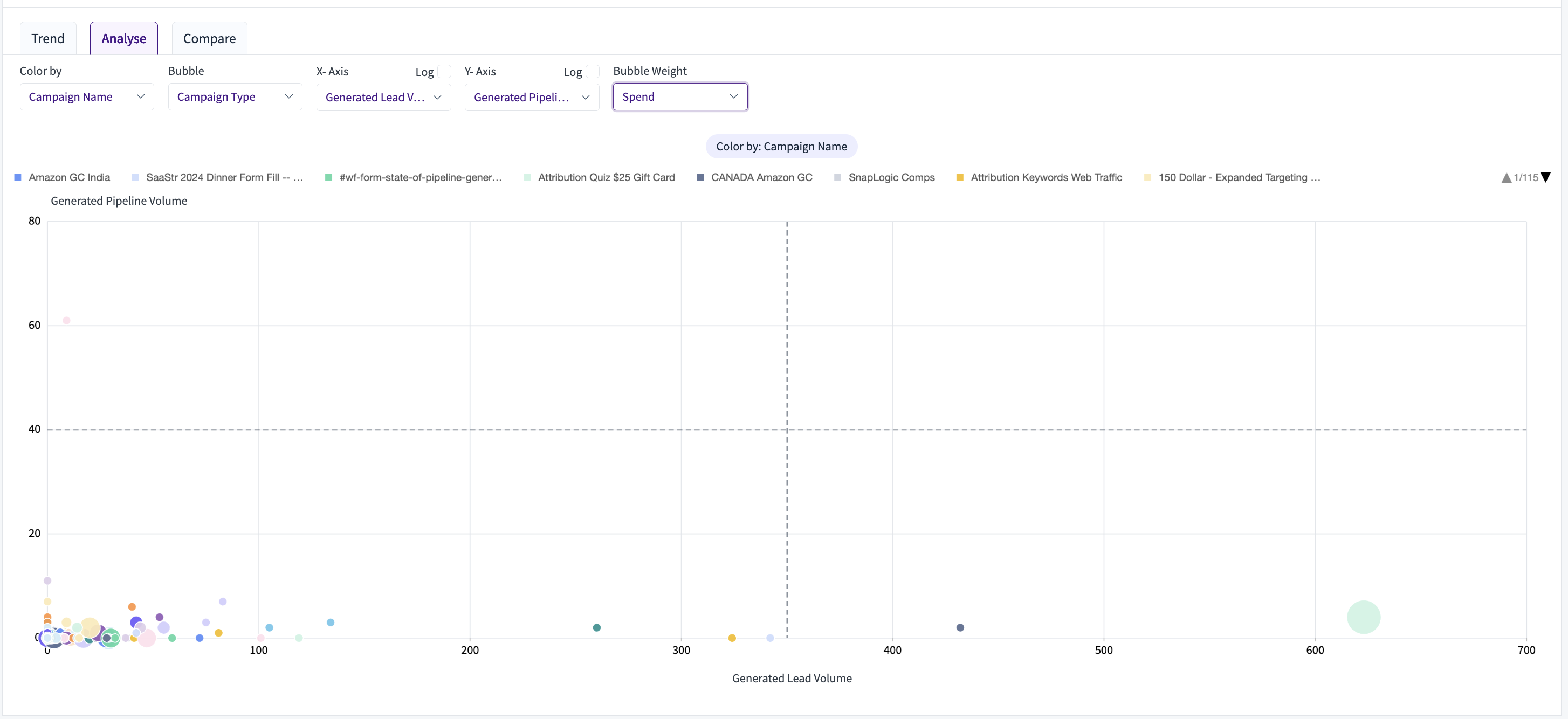
X-axis (Generated Lead Volume) vs. Y-axis (Generated Pipeline Volume): campaigns further to the right drove more raw leads; campaigns higher up converted into more pipeline value.
Bubble size (Spend): larger circles indicate higher marketing investment, letting you see which big-budget efforts drove (or failed to drive) proportionate results.
Color by Campaign Name with bubble by Campaign Type: each campaign is color-coded, so you can quickly spot patterns by grouping similar bubbles (e.g., HubSpot Form vs. Organic Post).
Dashed crosshairs (thresholds): the vertical and horizontal lines mark average lead and pipeline benchmarks — everything in the top-right quadrant is above average on both fronts.
Interactive filters let you recolor, switch axes (or log-scale them), and change the weight metric, so you can pivot the view to answer questions like "Which low-spend campaigns overperformed?" or "Where did we over-invest for minimal pipeline?"
Compare
.png)
The Compare sub-view shows a dual-axis bar chart that lets you directly juxtapose two metrics — here, Campaign Member Volume (turquoise bars, left axis) and Influenced Account Volume (gold bars, right axis) — across the dimension you choose. The Insights sub-view flips the purpose of this chart from comparing fixed groups to automatically surfacing the top or bottom performers on a single metric.
.png)
RevSure Insights
RevSure Recommendations let you define rules that determine whether RevSure suggests you continue, increase, wait and watch, or stop a campaign. You can use signals, projections, momentum, and growth to define these conditions.
To configure RevSure Recommendations, click the Recommendations button at the top right, next to the snapshot icon.
You can choose any metric to define these conditions. There are two condition types:
Metrics — conditions like Metric Name is greater than / less than / equal to a value x.
Trends — conditions like Metric Name, cumulative/relative growth, weekly/monthly/quarterly, greater than / less than / equal to a percentage x for the previous n weeks/months/quarters.
For each rule, you can set multiple conditions, including a combination of metrics and trends. You can also choose whether all conditions must be met or any condition is sufficient.
You can set conditions based on overall performance or on recent performance, based on the momentum the campaign is generating. For each condition, choose which recommendation to show when it is satisfied: Increase, Wait & Watch, Continue, or Stop.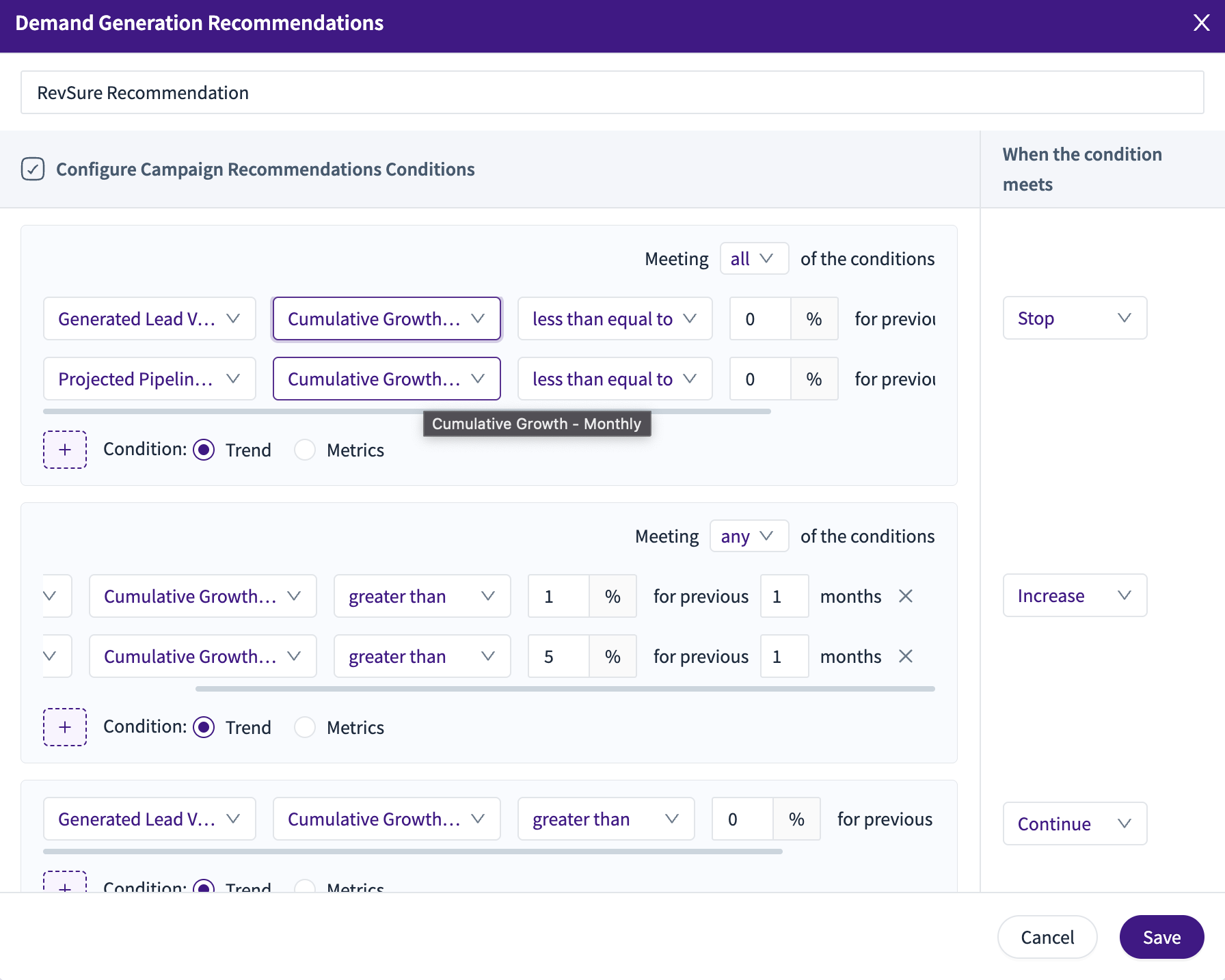 Once set, use the RevSure Insights button above the Demand Generation Effectiveness table to enable RevSure Recommendations.
Note: Recommendations are generated from the list of campaigns available in the current view. To use Recommendations, save your selection as a view before enabling them
.png)
Campaign Role in Funnel helps you understand where a particular campaign or campaign type is effective in the funnel. The effectiveness comes from AI attribution, which RevSure uses to determine which stage conversions are attributed to that campaign or campaign type.
.png)
Drill Down
.png)
The Demand Generation Effectiveness drill-down provides detailed insight into channels and campaigns, including key outcome metrics such as Budget, Spend, Cost per Lead, Pipeline ROI, and Booking ROI. Drill into each campaign to see cross-funnel metrics and insights, including Generated Volume, $ Value, Stage-to-Stage Conversion, Stage-to-Stage Velocity, and more. The drill-down has four sections, described below.
Metrics Section
This section shows how leads progress through each stage of the funnel. It displays volume or value across TOFU–BOFU stages, along with a detailed stage-wise metrics table for deeper analysis.
.png)
Details Section
The Details section lets you drill into the actual leads, accounts, opportunities, bookings, and leakage contributing to your metrics. It also lets you break down (decompose) the data by dimensions like industry, company size, lead source, or stage, while viewing a full list of associated records with metrics like scores, journey details, and more.
.png)
Performance Trend Section
The Performance Trends view shows how your generated, projected, and other key metrics change over time (weekly, monthly, etc.). It provides a side-by-side tabular comparison of volume, value, and ROI trends to help you track performance shifts.
.png)
The Chart view in Performance Trends visualizes how key metrics (Spend, Pipeline, Bookings, etc.) evolve over time. It lets you plot two metrics together on primary and secondary axes and view trends weekly, monthly, or quarterly, in either relative or cumulative form.
.png)
Cohort Section
The Cohort dropdown lets you drill into Progressed Volume from the Created stage to see exactly which records moved forward — and when..png)
LinkedIn View-through Attribution
LinkedIn View-Through Attribution allows us to attribute influence from LinkedIn ads even when a user does not click on them. LinkedIn shares impression data with us at the account/company level, which tells us which companies were exposed to a campaign, but not the specific individuals who viewed it.
Using this impression data, we can factor these as touchpoints in the attribution models.