Understanding the Map View in Lead Prioritization
The Map View in RevSure’s Lead Prioritization module helps you see your leads like never before—visually, geographically, and strategically. It’s your bird’s-eye view into where your leads are coming from, and more importantly, which ones are most likely to convert.
Let’s walk through how it works and how you can get the most out of it.
What’s the Map View All About?
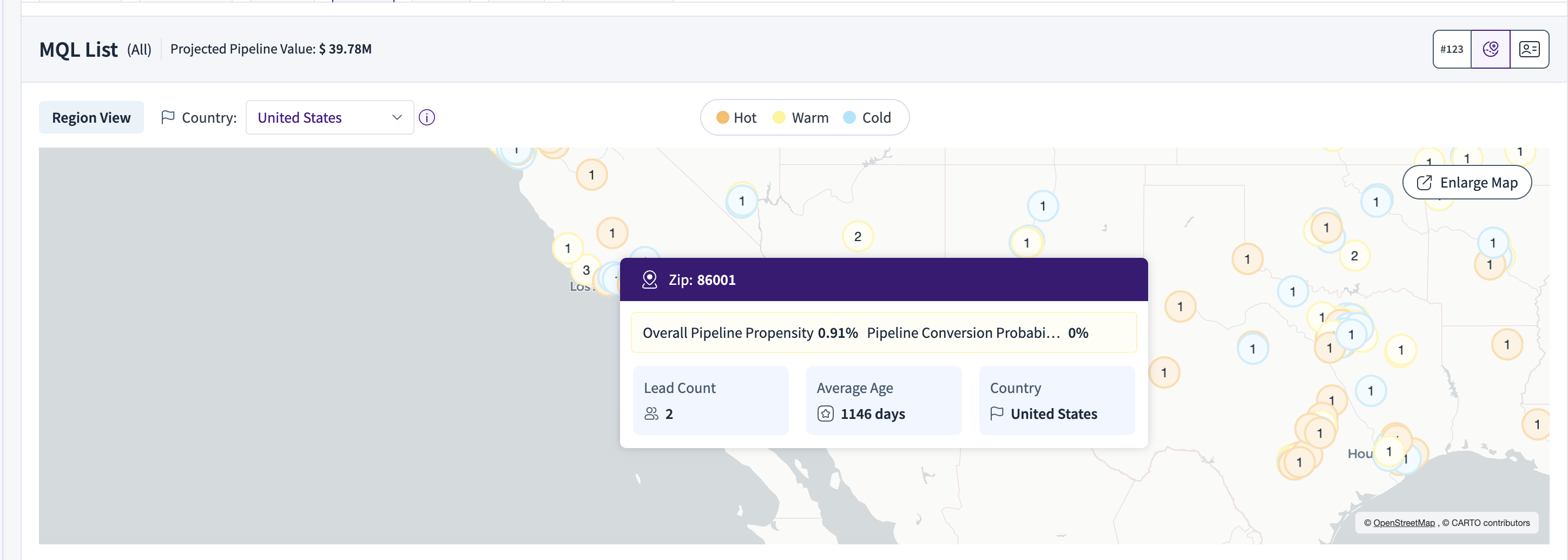
At its core, Map View takes lead data from Salesforce (SFDC)—including latitude and longitude coordinates, as well as postcode and country—and plots it onto an interactive map. It does this in clusters based on where your leads are located.
But the magic doesn’t stop at location. It also evaluates how likely those leads are to convert into pipeline and bookings. This is done using a percentile-based model that assigns each cluster a colour based on its conversion probability:
Hot – Very likely to convert (high-priority leads)
Warm – Somewhat likely to convert (worth engaging)
Cold – Less likely to convert (monitor or nurture)
So at a glance, you can see which regions are heating up—and where your next deals might come from.
What Can You Do With the Map?
Map View isn’t just for visualizing—it’s built for action. Here's how you can interact with it:
Click on a cluster to instantly filter the table below and see the specific leads from that region.
Hover over a cluster to view quick details about the leads within it.
Use the country dropdown to focus your view on a specific geography.
Apply filters at the top to refine the map based on lead status, time period, or other important dimensions.
Click “Enlarge Map” for a full-screen experience when you need more space to explore.
Dive Deeper: The Lead Table Below
Beneath the map, you’ll find a detailed lead list that automatically updates based on your interactions. Here, you can go from a high-level geographic view to one-on-one lead engagement.
Click on any one of the clusters to see a filtered view of the lead details present in the cluster.
Each row in the table shows:
Lead Name & ID
Their Journey Timeline
A summary like “Current Quarter Pipeline Propensity”
Account Name & ID
Country
Other key Salesforce fields
This makes it incredibly easy to switch between big-picture strategy and hands-on action.
Filters That Work For You
Whether you’re running a global campaign or zeroing in on a region, Map View lets you slice and dice the data your way:
Time Range – Look at leads from the last year, or customize your own window.
Lead Status Tabs – Instantly switch between Leads, MQL, SQL, and SAL.
Group By – Organize your lead list by whatever matters most to you.
Top-filters: Apply top-filters based on your required view by selecting the dimensions, and see your leads populate on the map.
Country: Want to see leads by a country view? Apply the country filter present in the Map view to filter by country.
Tips to Get the Most Out of Map View
Start with hot clusters—they represent the highest-converting opportunities.
Use the Country filter to tailor your approach by region or run localized campaigns.
Combine insights from Journey Timeline + Propensity scores to time your outreach perfectly.
Going into a strategy meeting? Enlarge the map for a presentation-ready view.
A Quick Visual Tour
Here’s what the experience looks like in action:
A U.S. focused map view showing clustered lead propensities:
.png)
On hover, you can see the cluster details: