Introduction
The Pipeline Health page provides various metrics and views to assess the pipeline health from multiple viewpoints. This helps in making business decisions more effectively, such as actions to be taken to improve pipeline health or things to do to close more opportunities for a healthy pipeline. The filters section at the top of the page helps you view the charts based on various data dimensions.
Pipeline Health Metrics can be found here
Customise
The ‘Customise’ option found at the top-right of the page (gear icon) can be used to see/hide the sections and charts that you are interested in.
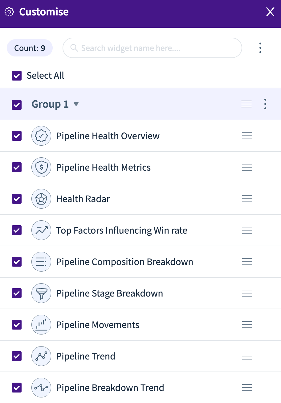
Sections and Charts
Below are the various sections that will provide you with various metrics and charts to assess the health of your pipeline and compare it to how it was in the past and how it is predicted to be in the future. Each section has a few options next to the section name. Each section is also collapsible for easier viewing.
Pipeline Health Overview
The Pipeline Health Overview section gives you various metrics for each quarter (cards). You can select/deselect the metrics you want to view using the dropdown menu on the top-right side of the card. You can also compare the current metrics with each of the same metrics from last week or month, or by selecting a custom date range.
These metrics can be viewed in terms of ‘Value’ (revenue) or ‘Volume’. The metrics can further be filtered for all opportunities or a particular type of opportunity (like Renewal, New Business).
.png)
Pipeline Health Metrics
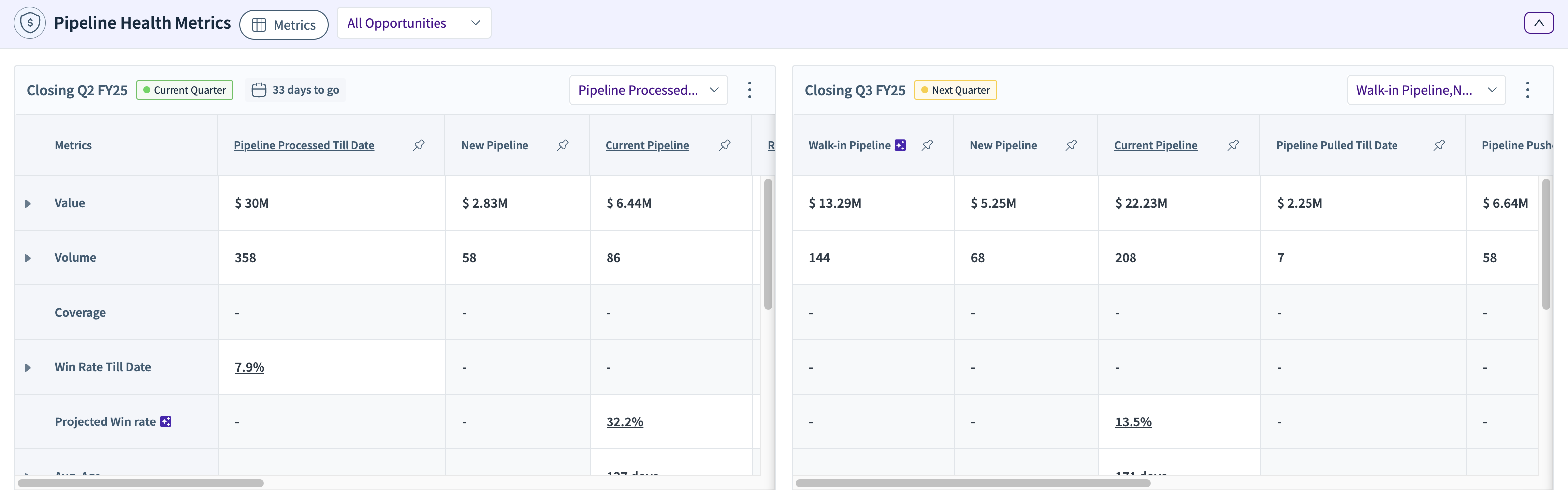
These tables show various metrics that help you assess the health of your pipeline in terms of ‘Value’ and ‘Volume’. The tables are for the current quarter and the next quarter.
If you expand any of the sections in the table, you can compare the current quarter’s numbers with those from the last quarter and also last year (same quarter).
The filters next to the name of the section help you select the metrics you want to view (rows in the tables) and the type of opportunities to filter the data for. Additionally, within each table, you can select the column metrics you want to view for each row.
Health Radar
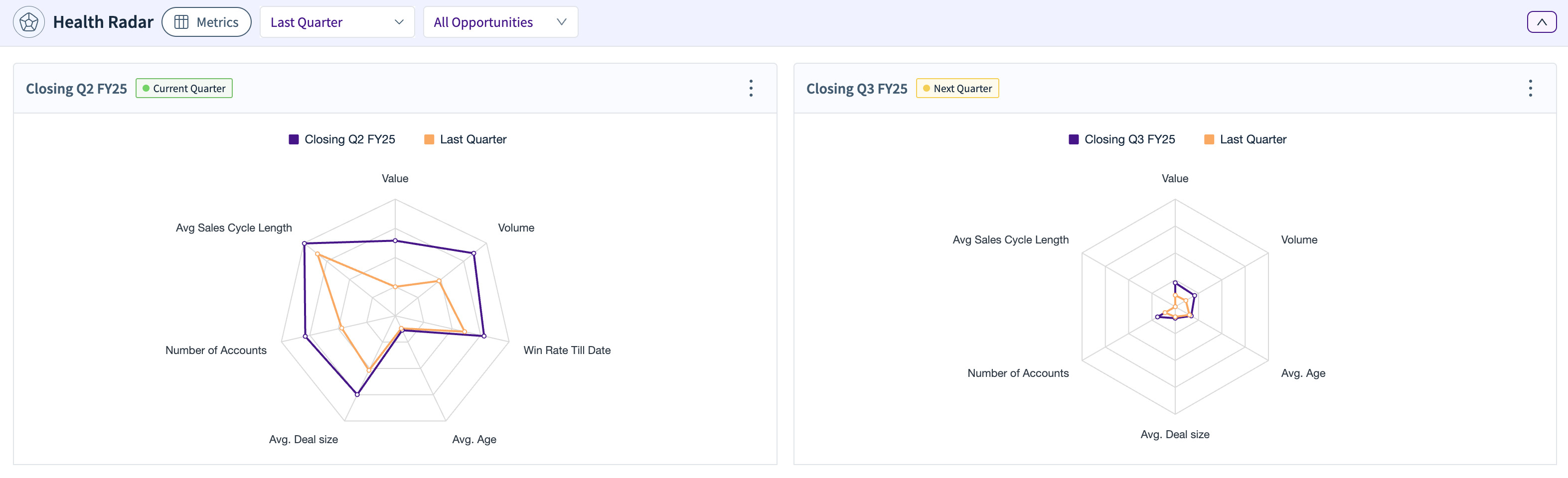
These charts help you assess the pipeline health for the current quarter and compare it with the previous quarter’s/year’s numbers based on the metrics selected from the 'Metrics' selection next to the section title. You can also choose the data to be shown (default is ‘All Opportunities’).
Top Factors Influencing Win Rate
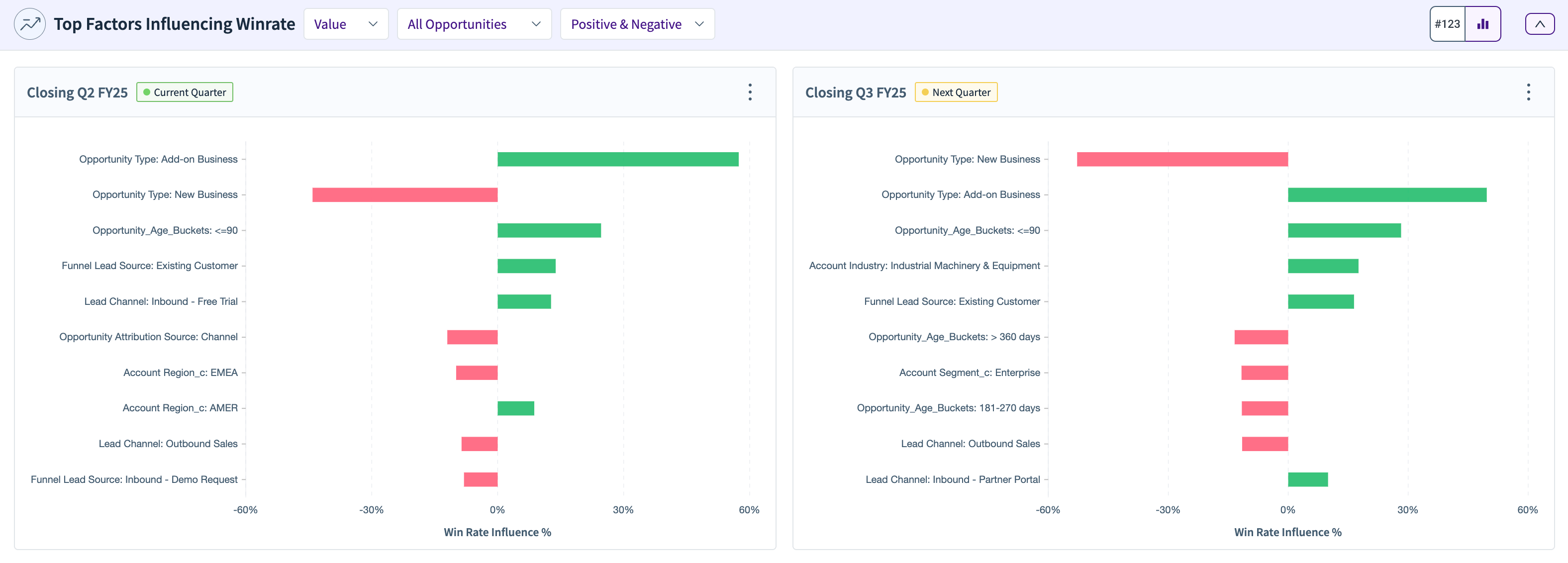
This section shows the contribution of the various factors that contribute to the win rate for the current and the next quarter. The factors can have a positive effect or a negative effect. Please note that the factors and their contributions to the ‘Value’ based win rate will be different from the factor contributions for the ‘Volume’ based win rate. You can also select to see only the positive factors or only the negative factors.
The factors driving win rates are a relative % based on likelihood analysis that says this factor drives the win rates/conversion probability XX% higher or lower compared to the average of all opportunities in that stage.
Pipeline Composition Breakdown
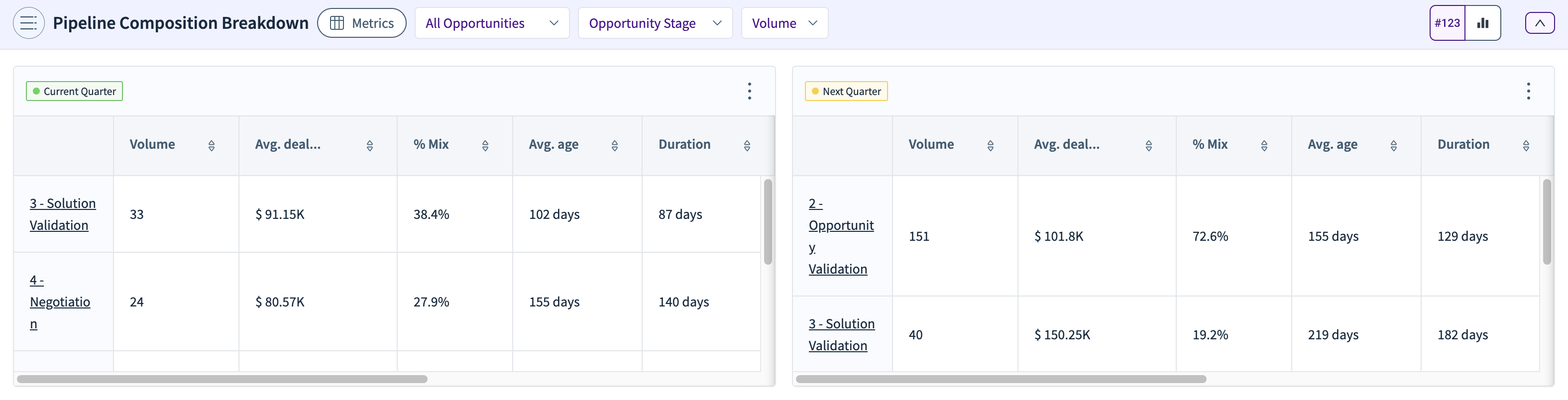
This section shows the composition breakdown of the pipeline for the current and next quarter. This section can be viewed in terms of ‘Value’ or ‘Volume’. You can select the metrics to be viewed (columns) from the ‘Metrics’ section. Along with that, you can also select all or a selected type of opportunities along with a data dimension to further filter and update the calculated metrics.
You also have a chart view along with the table view. The bar chart view shows each stage of the funnel for the selected data dimension, accompanying the respective chart.
In this widget, you can see the win rate influence being calculated for a particular value of the composition based on the likelihood analysis. For example, Funnel Lead Source = ‘Referral’ has a +19.4% influence, whereas Funnel Lead Source = ’Sales Generated’ has a -16.60% influence.
It is calculated using an adjustment variable, which, if > 1, increases the win rate and if <1, decreases the win rate against the average of all opportunities.
Relative win rate = Average Adjustment * Overall Historical Win rate
Win Rate Influence percentage = (Average Adjustment — 1) * Opp % Mix

Pipeline Stage Breakdown
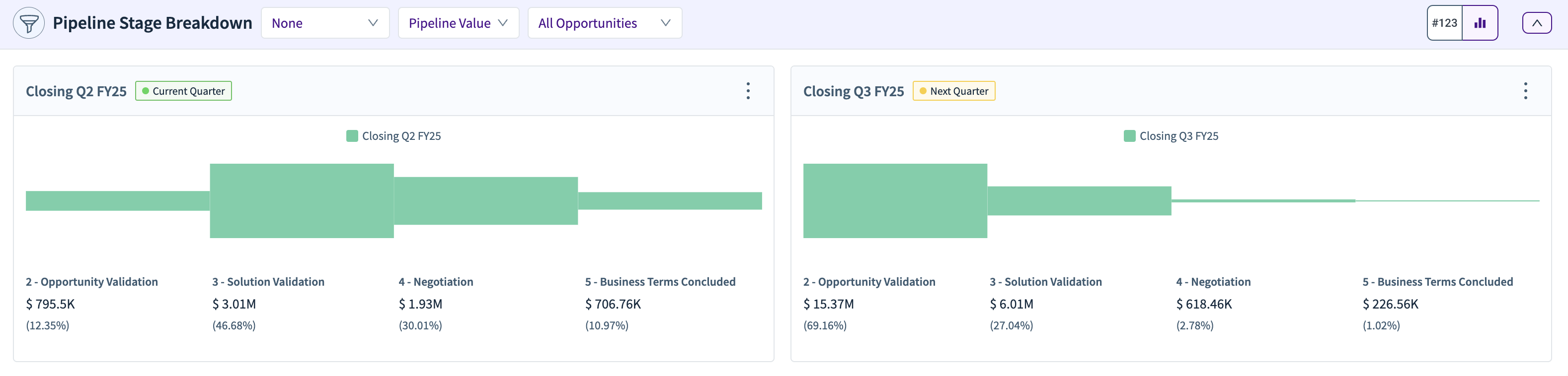
This section breaks down the various stages of your pipeline based on ‘Value’, ‘Volume’, ‘Age’, or ‘Duration’. You can also compare the pipeline breakdown of stages with the numbers for each stage from last quarter or last year. Furthermore, the pipeline breakdown can be viewed for all opportunities or any particular type of opportunity.
Pipeline Movements
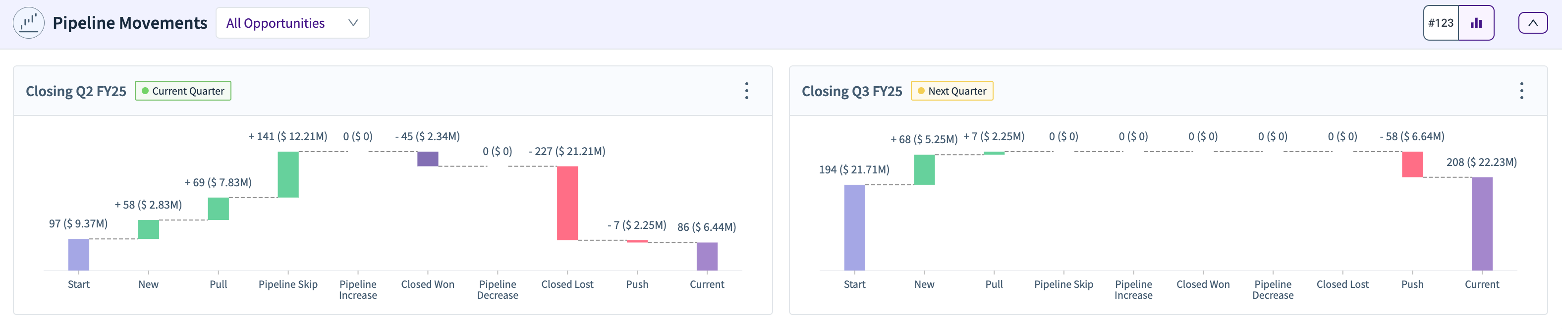
The Pipeline Movements section shows how the opportunities move from one stage to another in terms of increase or decrease in their number and value. The stages go from ‘Start’ to ‘Current’ and show how the pipeline has moved and evolved since the start of the quarter to the current date.
Start — Pipeline that you walked into the quarter with, with a close date in the quarter. Also known as Walk-in Pipeline
New — Pipeline that is created in a quarter with a closing date in the same quarter
Pull — Pipeline that is pulled into the quarter from other quarters based on their closing date.
Pipeline Skip — Opportunities that skipped the pipeline stage and went directly into either the booking or leakage stages
Pipeline Increase — Opportunities whose values increased during the quarter
Pipeline Decreased — Opportunities whose values decreased during the quarter
Closed Won — Opportunities that progressed to the Booking stage during the quarter
Closed Lost — Opportunities that progressed to the leakage stage during the quarter
Push — Opportunities that got pushed out of the quarter to another quarter based on their closing date
Current — Opportunities that are currently open with a closing date in that quarter as of the current date.
Pipeline Trend
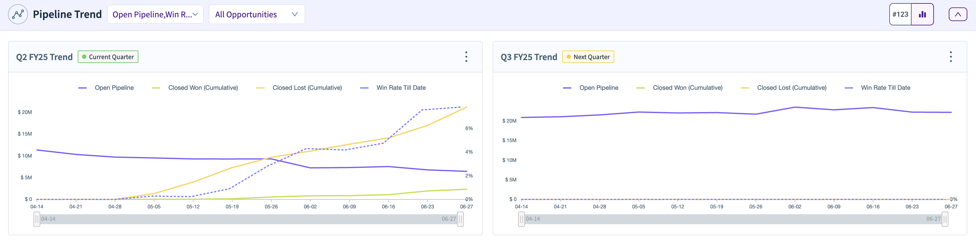
This section helps you view the trends of each of the stages of the pipeline. The dropdowns can be used to select the stage(s) that you want to view the trend(s) for, and if you want to view them for all opportunities or particular types of opportunities (like Renewal, New Business). Use the slider below to filter and zoom into a particular time range.
Push (Cumulative), Pull (Cumulative), Closed Won (Cumulative), and Closed Lost (Cumulative) are cumulative versions of their corresponding relative metrics. The cumulative metrics will always be increasing.
Pipeline Breakdown Trend
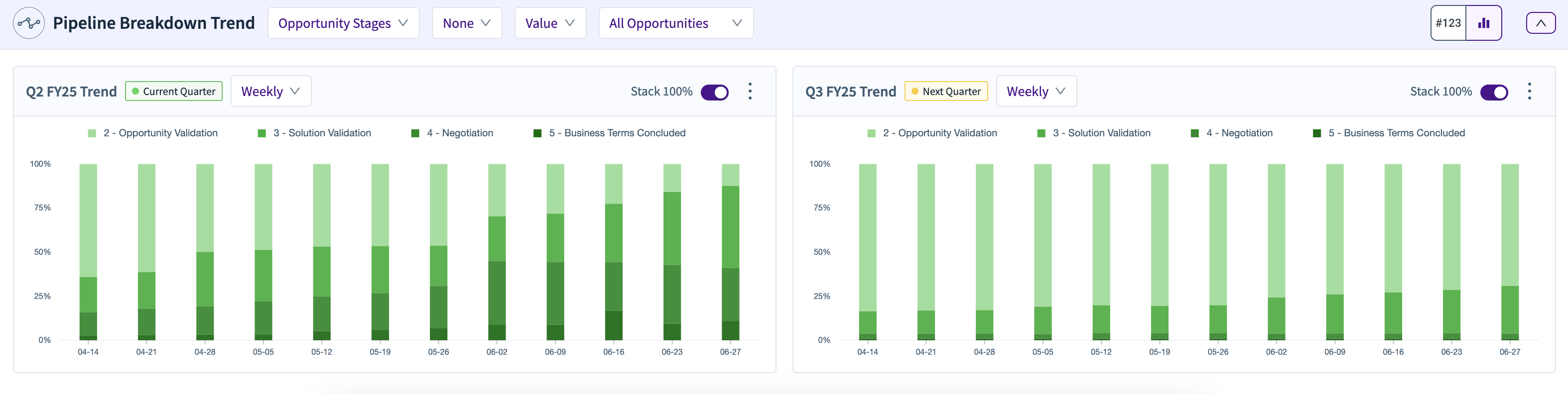
The Pipeline Breakdown Trend section helps you view a snapshot of the pipeline on a per-week or per-month basis for various pipeline stages (as a column chart). It gives you how your pipeline looked at various weeks or months of your quarter.
You can view the breakdown in terms of ‘Value’ or ‘Volume’.
The chart also allows you to compare the current pipeline with the pipeline from last quarter or last year.
You also have a “Stack 100%” toggle. If you switch this ON, then every column of the chart is shown as a percentage between 0% and 100% and the contribution of each stage of the pipeline is also stacked accordingly as per their percentage contribution.
.png)
Open Pipeline Trends by Quarter of Close
This widget shows the currently open pipeline closing in each of the next 8 quarters. This value would be similar to the values seen in the current pipeline of Pipeline Readiness. The closing time period selection shows the x-axis selection of what should be the closing Quarter. You can also split this pipeline by different split dimensions.
